Setup, Quality Control and Sample Integration
Last updated on 2025-12-02 | Edit this page
Estimated time: 12 minutes
Overview
Questions
- How do we identify and remove low-quality cells in scRNA-seq data?
- What signs suggest batch effects between treatment conditions?
- When and why do we need to integrate datasets before downstream analysis?
- How do Harmony and Seurat CCA compare in aligning similar cell types?
Objectives
- Load and inspect a Seurat single-cell dataset (e.g., ifnb).
- Perform basic quality control and filtering using mitochondrial content and feature counts.
- Visualise data distributions with violin plots and scatterplots.
- Recognise when integration is needed and apply both Harmony and CCA integration methods.
- Perform initial clustering and visualise condition alignment in UMAP space.
Step 1. Load the packages and data
Today we’ll be working with Seurat (a popular scRNA-seq analysis package). SeuratData will be used to load in the experimental data we’re analysing. Tidyverse is a fundamental and very popularly used set of tools to wrangle and visualise data.
We’ll need to load the DESeq2 R package for when we explore pseudobulk DE approaches
pheatmap and grid are two really useful packages for creating custom heatmaps with our scRNA-seq data and exporting figures, respectively.
R
library(Seurat)
library(SeuratData)
library(tidyverse)
library(DESeq2)
library(patchwork)
library(pheatmap)
library(grid)
library(metap)
library(harmony)
library(DropletUtils)
library(ggplot2)
library(SingleR)
library(Celldex)

set.seed(4242) # Set Seed for Reproducibility
We’re using the ifnb public dataset provided by Seurat. This dataset contains PBMC data from 8 lupus patients before and after interferon beta treatment.
I strongly encourage you to explore the other datasets offered by the SeuratData package, it can be really good practice in your spare time.
The ifnb Seurat object we’re loading in here was originally made in
Seurat v4, there have since been a lot of changes from Seurat v4 to v5
so we’ll use the UpdateSeuratObject() function to update
the Seurat object so that it is compatible for today.
R
head(AvailableData()) # if you want to see the available SeuratData datasets use this function
R
InstallData("ifnb") # install our treatment vs control dataset for today

data("ifnb") # Load the dataset into our current R script
ifnb <- UpdateSeuratObject(ifnb) # Make sure the seurat object is in the format of Seurat v5

str(ifnb) # we can use this to take a look at the information in our Seurat Object
Challenge
Looking at the output from the str() function above, can
you tell whether this seurat object is processed or unprocessed?
When loading in seurat objects, we can have a look at what processing steps have been performed on it by using the str() function. In the output we can tell that the ifnb Seurat object is unprocessed because the scale.data slot is empty, no variable features have been identified, and no dimensionality reduction functions have been performed.
Step 2: Run QC, filter out low quality cells
Lets start by processing our data (run the standard seurat workflow steps including preprocessing and filtering).
First we need to take a look at QC metrics, then decide on the thresholds for filtering.
Challenge
QC for droplet-based protocols
In droplet-based protocols (e.g., 10x Genomics), millions of droplets are formed, but only some droplets contain exactly one real cell. Several types of “bad droplets” appear:
- Empty droplets (no real cell)
- Doublets (two cells in one droplet)
R
# Step 2a: QC and filtering
ifnb$percent.mt <- PercentageFeatureSet(object = ifnb, pattern = "^MT-") # First let's annotate the mitochondrial percentage for each cell

head((ifnb@meta.data)) # we can take a look mitochondrial percentages for the seurat object by viewing the seurat objects metadata
OUTPUT
                  orig.ident nCount_RNA nFeature_RNA stim seurat_annotations
AAACATACATTTCC.1 IMMUNE_CTRL       3017          877 CTRL          CD14 Mono
AAACATACCAGAAA.1 IMMUNE_CTRL       2481          713 CTRL          CD14 Mono
AAACATACCTCGCT.1 IMMUNE_CTRL       3420          850 CTRL          CD14 Mono
AAACATACCTGGTA.1 IMMUNE_CTRL       3156         1109 CTRL                pDC
AAACATACGATGAA.1 IMMUNE_CTRL       1868          634 CTRL       CD4 Memory T
AAACATACGGCATT.1 IMMUNE_CTRL       1581          557 CTRL          CD14 Mono
                 percent.mt
AAACATACATTTCC.1          0
AAACATACCAGAAA.1          0
AAACATACCTCGCT.1          0
AAACATACCTGGTA.1          0
AAACATACGATGAA.1          0
AAACATACGGCATT.1          0
R
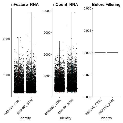
# Step 2b: Visualise QC metrics and identify filtering thresholds
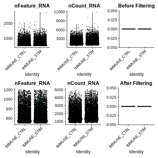
qc.metric.plts <- VlnPlot(ifnb, features = c("nFeature_RNA", "nCount_RNA", "percent.mt"), ncol = 3) +
ggtitle("Before Filtering")
WARNING
Warning in SingleExIPlot(type = type, data = data[, x, drop = FALSE], idents =
idents, : All cells have the same value of percent.mt.
R
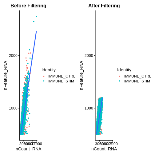
association.plt.raw <- FeatureScatter(ifnb, feature1 = "nCount_RNA", feature2 = "nFeature_RNA") + geom_smooth(method = "lm") +
  ggtitle("Before Filtering")

qc.metric.plts
R
association.plt.raw
OUTPUT
`geom_smooth()` using formula = 'y ~ x'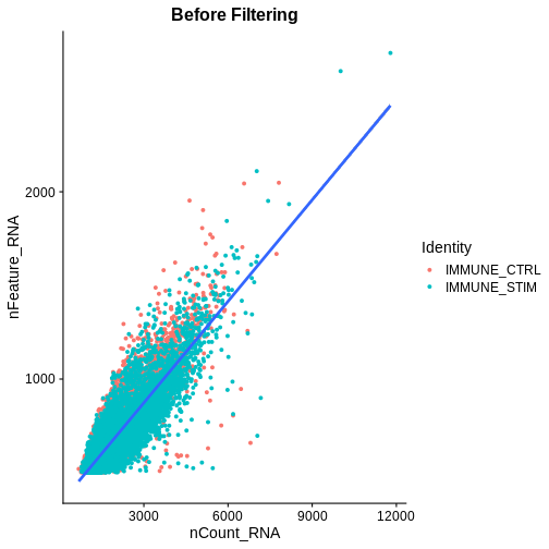
Looking at the violin plots of QC metrics, what do you think about the overall quality of the ifnb dataset?
After visualising QC metrics, we’ll move on to the actual filtering
R
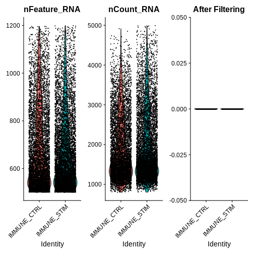
# Step 2c: filter out low-quality cells + visualise the metrics for our filtered seurat object
ifnb.filtered <- subset(ifnb, subset = nCount_RNA > 800 &
                          nCount_RNA < 5000 &
                          nFeature_RNA > 200 &
                          nFeature_RNA < 1200 &
                          percent.mt < 5)

qc.metric.plts.filtered <- VlnPlot(ifnb.filtered, features = c("nFeature_RNA", "nCount_RNA", "percent.mt"), ncol = 3) +
  ggtitle("After Filtering")
association.plt.filtered <- FeatureScatter(ifnb.filtered, feature1 = "nCount_RNA", feature2 = "nFeature_RNA") + geom_smooth(method = "lm") +
  ggtitle("After Filtering")

qc.metric.plts.filtered
R
association.plt.filtered
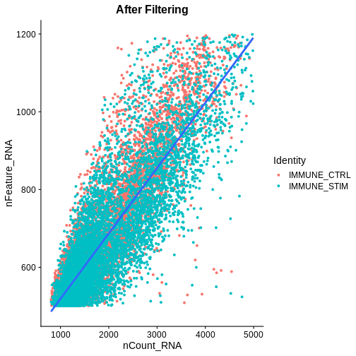
Let’s check how many cells we’ve filtered out (looks like ~400 cells were removed):
R
## Defining a couple helper functions to standardise x and y axis for two plots
get_plot_range <- function(plot) {
  data <- layer_data(plot)
  list(
    x = range(data$x, na.rm = TRUE),
    y = range(data$y, na.rm = TRUE)
  )
}
standardise_plt_scale <- function(plt1, plt2){

  # Get ranges for both plots
  range_raw <- get_plot_range(plt1)
  range_filtered <- get_plot_range(plt2)

  # Calculate overall range
  x_range <- range(c(range_raw$x, range_filtered$x))
  y_range <- range(c(range_raw$y, range_filtered$y))

  suppressMessages({
  # Update both plots with the same x and y scales
  association.plt.raw <- association.plt.raw +
    scale_x_continuous(limits = x_range) +
    scale_y_continuous(limits = y_range)

  association.plt.filtered <- association.plt.filtered +
    scale_x_continuous(limits = x_range) +
    scale_y_continuous(limits = y_range)
  })

  # Wrap the plots
  wrapped_plots <- wrap_plots(list(association.plt.raw, association.plt.filtered),
                              ncol = 2)

  return(wrapped_plots)
}

wrap_plots(list(qc.metric.plts, qc.metric.plts.filtered),
           ncol = 1)
R
association.plts <- standardise_plt_scale(association.plt.raw,
                                          association.plt.filtered)
association.plts
Let’s check how many cells we’ve filtered out (looks like ~400 cells were removed):
R
ifnb
OUTPUT
An object of class Seurat
14053 features across 13999 samples within 1 assay
Active assay: RNA (14053 features, 0 variable features)
 2 layers present: counts, data
R
ifnb.filtered
OUTPUT
An object of class Seurat
14053 features across 13548 samples within 1 assay
Active assay: RNA (14053 features, 0 variable features)
 2 layers present: counts, data
Next we need to split our count matrices based on conditions. This step stores stimulated versus unstimulated expression information separately, creating a list of RNA assays grouped by the “stim” condition. Note: this is important for downstream integration steps in Seurat v5.
R
ifnb.filtered[["RNA"]] <- split(ifnb.filtered[["RNA"]], f = ifnb.filtered$stim) # Lets split our count matrices based on conditions (stored within different layers) -> needed for integration steps in Seurat v5
Step 3: Before performing differential expression between the two conditions, let’s assess whether we need to integrate our data
After filtering out low quality cells, we want to visualise our data to see how cells group by condition and if we need to perform batch-effect correction (integration)
R
ifnb.filtered <- NormalizeData(ifnb.filtered)
OUTPUT
Normalizing layer: counts.CTRLOUTPUT
Normalizing layer: counts.STIMR
ifnb.filtered <- FindVariableFeatures(ifnb.filtered)
OUTPUT
Finding variable features for layer counts.CTRLOUTPUT
Finding variable features for layer counts.STIMR
ifnb.filtered <- ScaleData(ifnb.filtered)
OUTPUT
Centering and scaling data matrixR
## Centering and scaling data matrix

ifnb.filtered <- RunPCA(ifnb.filtered)
OUTPUT
PC_ 1
Positive:  TYROBP, C15orf48, FCER1G, CST3, SOD2, ANXA5, FTL, TYMP, TIMP1, CD63
	   LGALS1, CTSB, S100A4, KYNU, LGALS3, FCN1, PSAP, NPC2, ANXA2, IGSF6
	   S100A11, LYZ, SPI1, APOBEC3A, CD68, CTSL, NINJ1, HLA-DRA, CCL2, SDCBP
Negative:  NPM1, CCR7, CXCR4, GIMAP7, LTB, CD3D, CD7, SELL, TMSB4X, CD2
	   TRAT1, IL7R, PTPRCAP, IL32, ITM2A, RGCC, LEF1, CD3G, ALOX5AP, CREM
	   PASK, MYC, SNHG8, TSC22D3, BIRC3, GPR171, NOP58, CD27, RARRES3, CD8B
PC_ 2
Positive:  ISG15, ISG20, IFIT3, IFIT1, LY6E, TNFSF10, IFIT2, MX1, IFI6, RSAD2
	   CXCL10, OAS1, CXCL11, IFITM3, MT2A, OASL, TNFSF13B, IDO1, IL1RN, APOBEC3A
	   CCL8, GBP1, HERC5, FAM26F, GBP4, RABGAP1L, HES4, WARS, VAMP5, DEFB1
Negative:  IL8, CLEC5A, CD14, VCAN, S100A8, IER3, MARCKSL1, IL1B, PID1, CD9
	   GPX1, INSIG1, PHLDA1, PLAUR, PPIF, THBS1, OSM, SLC7A11, CTB-61M7.2, GAPDH
	   LIMS1, S100A9, GAPT, ACTB, CXCL3, C19orf59, MGST1, OLR1, CEBPB, FTH1
PC_ 3
Positive:  HLA-DQA1, CD83, HLA-DQB1, CD74, HLA-DRA, HLA-DPA1, HLA-DRB1, CD79A, HLA-DPB1, IRF8
	   MS4A1, SYNGR2, MIR155HG, HERPUD1, REL, HSP90AB1, ID3, HLA-DMA, TVP23A, FABP5
	   NME1, HSPE1, PMAIP1, BANK1, CD70, HSPD1, TSPAN13, EBI3, TCF4, CCR7
Negative:  ANXA1, GNLY, NKG7, GIMAP7, TMSB4X, PRF1, CD7, CCL5, RARRES3, CD3D
	   CD2, KLRD1, GZMH, GZMA, CTSW, GZMB, FGFBP2, CLIC3, IL32, MT2A
	   FASLG, KLRC1, CST7, RGCC, CD8A, GCHFR, OASL, GZMM, CXCR3, KLRB1
PC_ 4
Positive:  LTB, SELL, CCR7, LEF1, IL7R, CD3D, TRAT1, GIMAP7, ADTRP, PASK
	   CD3G, TSHZ2, CMTM8, SOCS3, TSC22D3, NPM1, CCL2, MYC, CCL7, CCL8
	   CTSL, SNHG8, TXNIP, CD27, S100A9, CA6, C12orf57, TMEM204, HPSE, GPR171
Negative:  NKG7, GZMB, GNLY, CST7, PRF1, CCL5, CLIC3, KLRD1, APOBEC3G, GZMH
	   GZMA, CTSW, FGFBP2, KLRC1, FASLG, C1orf21, HOPX, SH2D1B, TNFRSF18, CXCR3
	   LINC00996, SPON2, RAMP1, ID2, GCHFR, IGFBP7, HLA-DPA1, CD74, XCL2, HLA-DPB1
PC_ 5
Positive:  CCL2, CCL7, CCL8, PLA2G7, TXN, LMNA, SDS, S100A9, CSTB, ATP6V1F
	   CAPG, CCR1, EMP1, FABP5, CCR5, IDO1, TPM4, LILRB4, MGST1, CTSB
	   HPSE, CCNA1, GCLM, PDE4DIP, HSPA1A, CD63, SLC7A11, HSPA5, VIM, HSP90B1
Negative:  VMO1, FCGR3A, MS4A4A, CXCL16, MS4A7, PPM1N, HN1, LST1, SMPDL3A, ATP1B3
	   CASP5, CDKN1C, AIF1, CH25H, PLAC8, SERPINA1, TMSB4X, LRRC25, CD86, GBP5
	   HCAR3, RP11-290F20.3, COTL1, RGS19, VNN2, PILRA, STXBP2, LILRA5, C3AR1, FCGR3B
R
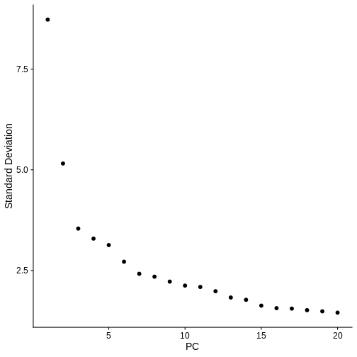
ElbowPlot(ifnb.filtered) # Visualise the dimensionality of the data, looks like 15 PCs is adequate to capture the majority of the variation in the data, but we'll air on the higher side and consider all 20 dimensions.
R
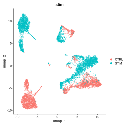
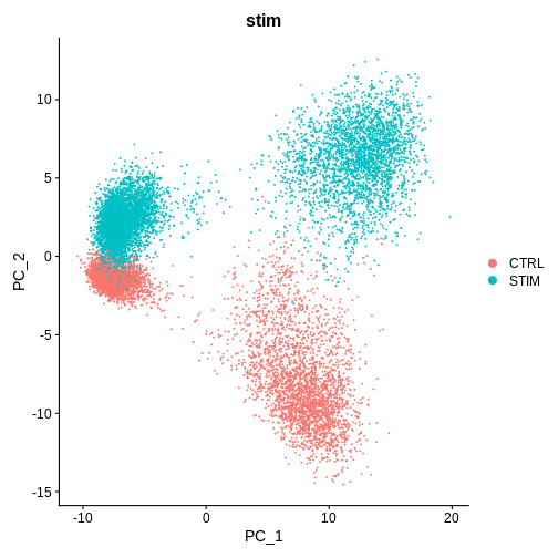
DimPlot(ifnb.filtered, reduction = 'pca', group.by = 'stim') # lets see how our cells separate by condition and whether integration is necessary
Challenge
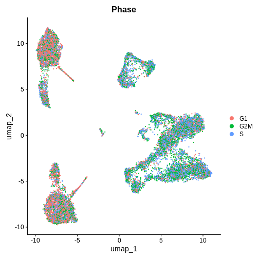
Cell Cycle Check 1 — BEFORE integration (after PCA / pre-Harmony / CCA)
Seurat also features a function,
CellCyleScoring to calculate which phase each individual
cell is in the cell cycle using canonical markers. You can read more
about it here.
Which phase in the cell cycle are the clusters in primarily? Are they different or the same between clusters?
R
# ---- Cell-cycle check (PRE-integration) ----
if (!exists("cc.genes.updated.2019")) data("cc.genes.updated.2019", package = "Seurat")

# Score S/G2M
ifnb.filtered <- CellCycleScoring(
  ifnb.filtered,
  s.features   = cc.genes.updated.2019$s.genes,
  g2m.features = cc.genes.updated.2019$g2m.genes,
  set.ident    = FALSE,
  search       = TRUE
)

# Quick UMAP on PCA (if you haven't already run it)
if (!"umap" %in% Reductions(ifnb.filtered)) {
  ifnb.filtered <- RunUMAP(ifnb.filtered, dims = 1:20, reduction = "pca")
}

# Visual + quick quant
DimPlot(ifnb.filtered, reduction = "umap", group.by = "Phase", pt.size = 0.3)
R
emb_pca <- Embeddings(ifnb.filtered, "pca")[,1:20]
pc_cor_S   <- sapply(1:20, \(i) cor(emb_pca[,i], ifnb.filtered$S.Score))
pc_cor_G2M <- sapply(1:20, \(i) cor(emb_pca[,i], ifnb.filtered$G2M.Score))
print(cbind(PC=1:20, r_S=round(pc_cor_S,3), r_G2M=round(pc_cor_G2M,3)))
OUTPUT
      PC    r_S  r_G2M
 [1,]  1 -0.262 -0.245
 [2,]  2  0.065  0.048
 [3,]  3  0.023  0.038
 [4,]  4  0.002 -0.020
 [5,]  5 -0.003  0.015
 [6,]  6 -0.003  0.090
 [7,]  7 -0.045 -0.038
 [8,]  8  0.007 -0.010
 [9,]  9 -0.014  0.012
[10,] 10 -0.021 -0.061
[11,] 11 -0.006  0.064
[12,] 12 -0.008  0.008
[13,] 13  0.031  0.042
[14,] 14  0.008 -0.027
[15,] 15  0.011  0.015
[16,] 16 -0.014 -0.007
[17,] 17 -0.010  0.011
[18,] 18  0.009  0.006
[19,] 19  0.003  0.027
[20,] 20 -0.015  0.026
These are PBMCs before and after treatment, there should be cells that are similar between both conditions, it looks like we’ll have to run some batch effect correction to overlay similar cell-types from both conditions to perform downstream analysis.
Do you think we need to integrate our data? Hint: Look at the UMAP and PC1/PC2 plots we made above
What do you think would happen if we were to perform unsupervised clustering right now, without integrating our data (or overlaying similar cells on top of each other from both conditions)?
Step 4: Integrating our data using the harmony method
Seurat v5 has made it really easy to test different integration methods quickly, let’s use a really popular approach (harmony) first.
R
# code adapted from: https://satijalab.org/seurat/articles/seurat5_integration
ifnb.filtered <- IntegrateLayers(object = ifnb.filtered,
                                 method = HarmonyIntegration,
                                 orig.reduction = "pca",
                                 new.reduction = "harmony")
OUTPUT
The `features` argument is ignored by `HarmonyIntegration`.
Transposing data matrix

Using automatic lambda estimation

Initializing state using k-means centroids initialization

Harmony 1/10

Harmony 2/10

Harmony 3/10

Harmony converged after 3 iterations

This message is displayed once per session.
R
ifnb.filtered <- RunUMAP(ifnb.filtered, reduction = "harmony", dims = 1:20, reduction.name = "umap.harmony")
OUTPUT
00:44:41 UMAP embedding parameters a = 0.9922 b = 1.112
00:44:41 Read 13548 rows and found 20 numeric columns
00:44:41 Using Annoy for neighbor search, n_neighbors = 30
00:44:41 Building Annoy index with metric = cosine, n_trees = 50
0%   10   20   30   40   50   60   70   80   90   100%
[----|----|----|----|----|----|----|----|----|----|
**************************************************|
00:44:43 Writing NN index file to temp file /tmp/RtmpKAZjB2/file272b67635406
00:44:43 Searching Annoy index using 1 thread, search_k = 3000
00:44:47 Annoy recall = 100%
00:44:48 Commencing smooth kNN distance calibration using 1 thread with target n_neighbors = 30
00:44:50 Initializing from normalized Laplacian + noise (using RSpectra)
00:44:51 Commencing optimization for 200 epochs, with 586822 positive edges
00:44:51 Using rng type: pcg
00:44:57 Optimization finished
R
after.harmony <- DimPlot(ifnb.filtered, reduction = "umap.harmony", group.by = "stim") +
  ggtitle("After Harmony Integration")
before.integration <- DimPlot(ifnb.filtered, reduction = "umap", group.by = "stim") +
  ggtitle("Before Integration")

before.integration | after.harmony
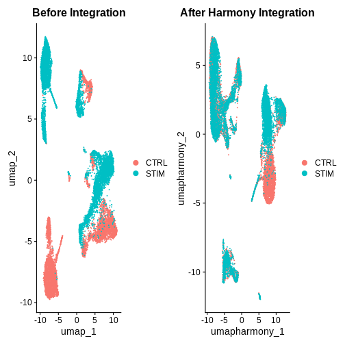
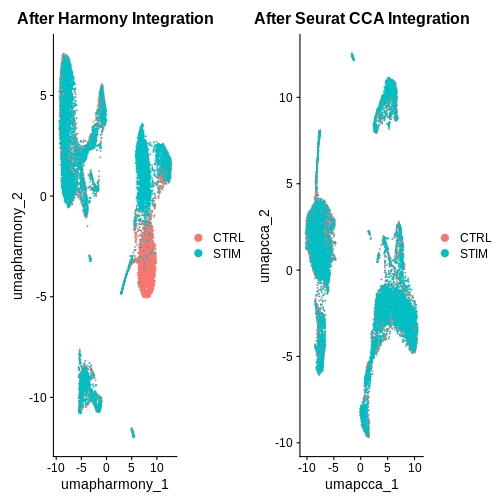
Looking at the UMAPs above, do you think integration was successful?
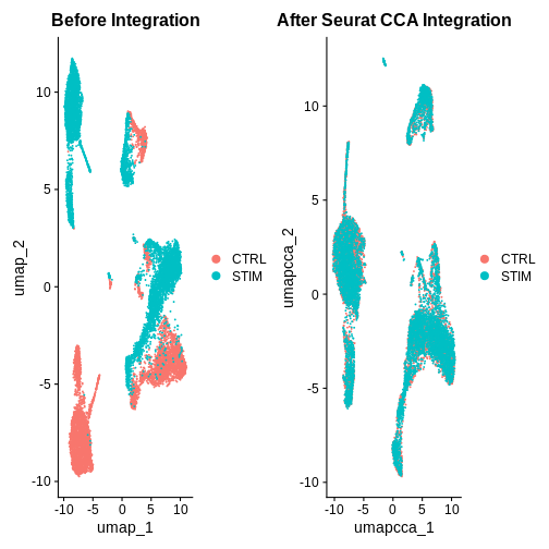
Step 5: Integrating our data using an alternative Seurat CCA method
R
ifnb.filtered <- IntegrateLayers(object = ifnb.filtered,
                                 method = CCAIntegration,
                                 orig.reduction = "pca",
                                 new.reduction = "integrated.cca")

ifnb.filtered <- RunUMAP(ifnb.filtered, reduction = "integrated.cca", dims = 1:20, reduction.name = "umap.cca")

after.seuratCCA <- DimPlot(ifnb.filtered, reduction = "umap.cca", group.by = "stim") +
  ggtitle("After Seurat CCA Integration")

before.integration | after.seuratCCA
R
after.harmony | after.seuratCCA
R
## Show example slide of integration 'failing' but due to different cell types in each sample ***
What do you think of the integration results now?
Hint: Also look at the PC1 and PC2 plots for each integration method.
Challenge
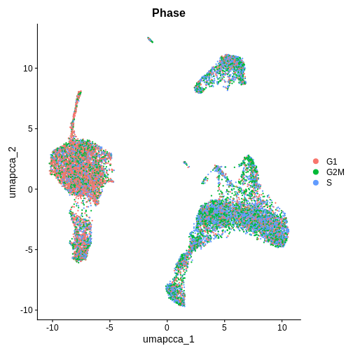
Cell Cycle Check 2 — AFTER integration (after umap.cca + clustering)
Now that we have integrated the data, do you think the results will be the same or different?
R
# ---- Cell-cycle check (POST-integration) ----

# Visual on integrated embedding
DimPlot(ifnb.filtered, reduction = "umap.cca", group.by = "Phase", pt.size = 0.3)
R
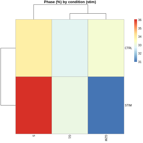
# Phase composition by cluster and by condition
tab_phase_cluster <- prop.table(table(ifnb.filtered$seurat_clusters, ifnb.filtered$Phase), 1) * 100
ERROR
Error in `x[[i, drop = TRUE]]` at SeuratObject/R/seurat.R:2939:3:
! 'seurat_clusters' not found in this Seurat object
 Did you mean "seurat_annotations"?
R
tab_phase_cond    <- prop.table(table(ifnb.filtered$stim,            ifnb.filtered$Phase), 1) * 100
pheatmap(tab_phase_cluster,
         main = "Phase (%) by cluster",
         display_numbers = TRUE,
         number_format = "%.1f")
ERROR
Error: object 'tab_phase_cluster' not foundR
pheatmap(tab_phase_cond, main = "Phase (%) by condition (stim)")
Step 6: Perform standard clustering steps after integration
This step collapses individual control and treatment datasets together and needs to be done before differential expression analysis
R
ifnb.filtered <- FindNeighbors(ifnb.filtered, reduction = "integrated.cca", dims = 1:20)
OUTPUT
Computing nearest neighbor graphOUTPUT
Computing SNNR
ifnb.filtered <- FindClusters(ifnb.filtered, resolution = 0.5)
OUTPUT
Modularity Optimizer version 1.3.0 by Ludo Waltman and Nees Jan van Eck

Number of nodes: 13548
Number of edges: 521570

Running Louvain algorithm...
Maximum modularity in 10 random starts: 0.9002
Number of communities: 13
Elapsed time: 2 seconds
R
ifnb.filtered <- JoinLayers(ifnb.filtered)
Additional Challenges
Challenge
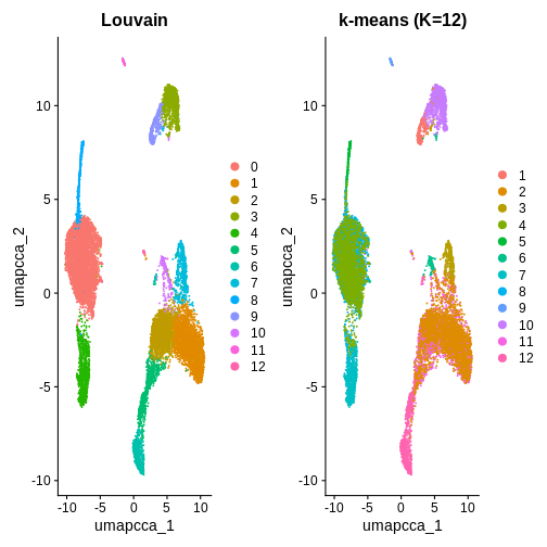
You can also use K-means clustering to cluster the data to compare to
other clustering methods. How can you use the kmeans()
function from stats to cluster the data and visualise it
using DimPlot()?
In this example, we used k = 5 purely for illustration. As you can see, it produces fewer clusters compared to the default Louvain algorithm. You are welcome to try different k values in your own time to explore whether k-means clustering is a suitable option in this context.
R
# K-means
emb <- Embeddings(ifnb.filtered, "pca")[, 1:20]
set.seed(1)
km <- kmeans(emb, centers = 12, nstart = 50)

ifnb.filtered$kmeans_k12 <- factor(km$cluster)

# Compare labelings
p1 <- DimPlot(ifnb.filtered, reduction = "umap.cca", group.by = "seurat_clusters") + ggtitle("Louvain")
p2 <- DimPlot(ifnb.filtered, reduction = "umap.cca", group.by = "kmeans_k12") + ggtitle("k-means (K=12)")
p1 | p2
R
# If you decide to proceed with k-means downstream:
Idents(ifnb.filtered) <- "kmeans_k12"
- QC filtering removes low-quality cells (e.g., low gene count or high mitochondrial %).
- Integration corrects sample-to-sample variation so cells group by biology, not by batch.
- Harmony and CCA both align shared cell states but use different mathematical strategies.